
For remodeling contractors, a logo isn’t decoration, it’s the first handshake with a potential client. In an industry where trust determines who gets the job, branding separates professionals from handymen with a pickup truck. A well-designed logo communicates credibility before a single word is spoken, whether it’s printed on a truck door, a yard sign, or a business card left on a kitchen counter. With homeowners vetting contractors through multiple channels, online directories, social media, and word of mouth, consistent visual identity has become non-negotiable for businesses serious about growth.
Key Takeaways
- A professional home remodeling logo builds trust and credibility with potential clients before they’ve even heard your pitch, acting as a first handshake that separates established contractors from one-person operations.
- A strong home remodeling logo should use color psychology strategically—blues and earth tones convey reliability and craftsmanship, while a limited palette of 2-3 colors ensures clarity across all reproduction formats from truck wraps to business cards.
- Effective remodeling logos avoid complexity and trends: simplicity ensures legibility at all sizes, monochrome versatility, and a design shelf life of 10+ years without looking dated.
- When designing your home remodeling logo, invest in proper file formats (vector files like AI and EPS) and test across multiple applications—business cards, yard signs, and job site visibility—before finalizing to prevent amateur-looking reproduction.
- Hiring a professional designer ($500–$3,000+) or using quality design platforms typically outperforms DIY attempts, as a polished logo directly impacts pricing power and attracts premium clients willing to pay for craftsmanship.
Why Your Home Remodeling Business Needs a Professional Logo
Remodeling projects are high-stakes decisions. Homeowners aren’t hiring someone to hang shelves, they’re inviting contractors into their homes to tear down walls, rewire circuits, or gut bathrooms. Trust is the commodity being sold, and visual branding establishes it faster than testimonials or portfolios.
A professional logo signals permanence. It tells potential clients the business isn’t a side hustle that’ll vanish mid-project. It creates recognition across touchpoints: the wrapped van parked in the driveway, the estimate packet, the invoice, the follow-up email. Consistency builds familiarity, and familiarity breeds confidence.
Beyond trust, a strong logo improves recall. When a neighbor asks for a contractor recommendation three months after seeing a yard sign, a memorable mark makes the difference between getting the referral and being forgotten. In competitive markets, platforms like HomeAdvisor and local directories prioritize businesses with complete, professional profiles, and a cohesive logo is part of that package.
Skipping professional branding isn’t just a missed opportunity: it’s a handicap. Generic clip art or hastily assembled WordArt undermines pricing power and positions the business as interchangeable. Premium clients, the ones willing to pay for quality, expect visual professionalism before they’ll consider craftsmanship.
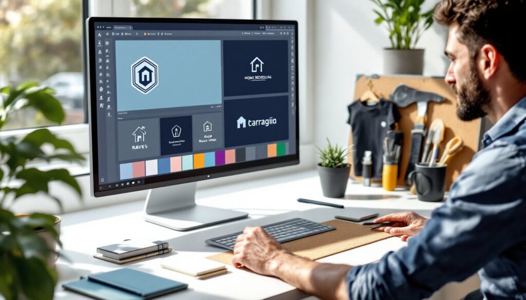
Essential Design Elements for Home Remodeling Logos
Effective remodeling logos balance approachability with authority. The mark needs to feel accessible enough for a kitchen consultation but polished enough for a commercial bid. Achieving that balance requires deliberate choices in color, type, and iconography.
Color Psychology for Remodeling and Renovation Brands
Color choices communicate values before a single service is listed. Blues dominate the remodeling space because they signal reliability and professionalism, think navy, slate, or steel blue. These hues feel grounded and stable, traits homeowners want when someone’s opening up their walls.
Earth tones convey craftsmanship. Warm browns, taupes, and charcoal grays align with natural materials: hardwood, stone, metal. They suggest hands-on expertise rather than corporate distance. Avoid overly bright or neon palettes: they read as gimmicky in an industry built on permanence.
Accent colors add energy without undermining trust. A secondary color, burnt orange, deep green, or gold, can highlight key elements (the house outline, the tool icon) while keeping the primary palette professional. Homeowners browsing Houzz for design inspiration notice brands that feel coordinated but not sterile.
Limit the palette to two or three colors. Reproduction matters. The logo will appear on embroidered hats, vinyl truck wraps, photocopied invoices, and low-res social media thumbnails. Simplicity ensures legibility across all formats.
Typography and Icon Choices That Convey Expertise
Typography should be sturdy, not trendy. Sans-serif fonts (Arial, Helvetica, Montserrat) communicate modernity and clarity. Slab serifs (Rockwell, Archer) add a touch of craftsmanship without feeling dated. Avoid script fonts and ornate typefaces, they’re difficult to read at small sizes and rarely project the seriousness clients expect.
Capitals vs. sentence case matters. All-caps company names (SMITH REMODELING) feel authoritative but can read as aggressive if the weight is too bold. Sentence case (Smith Remodeling) feels approachable but may lack presence on a job site sign. Test both at multiple sizes.
Icons should reference tools or structures, not clichés. A house outline is expected: a house with a circular saw blade or carpenter’s square makes it specific to remodeling. Roof peaks, hammers, level bubbles, and foundation lines all work. Paintbrushes and wrenches are overused, unless the business specializes in finish work or mechanical trades.
Avoid overly literal imagery. A logo crammed with a hammer, saw, drill, paint can, and blueprint turns into visual noise. Pick one strong symbol and let negative space do the work. The best marks are recognizable in silhouette.
Popular Home Remodeling Logo Styles and Trends
Logo trends in the remodeling industry evolve slower than residential design trends, predictability matters. That said, several styles dominate the current landscape.
Badge and crest designs communicate heritage and reliability. Circular or shield-shaped borders with the company name arched across the top and an icon centered inside create a timeless, established look. This style works well for family-owned businesses emphasizing longevity.
Minimalist geometric marks appeal to modern remodelers targeting design-forward clients. Clean lines, subtle angles, and restrained color palettes (often monochrome with a single accent) align with contemporary aesthetics. These logos work especially well for kitchen and bath specialists who want to match the sleek finishes they install.
Illustrated icons with bold type strike a middle ground. A detailed but simplified illustration, say, a hand-drawn miter saw or a dimensional house frame, paired with thick, confident typography balances craftsmanship with professionalism. This approach is popular on platforms like ImproveNet, where contractors showcase portfolios alongside their branding.
Lettermark logos (initials only) suit businesses with long or difficult-to-spell names. A well-designed “JR Construction” or “M&S Remodeling” mark keeps things clean and scalable, though it requires stronger initial marketing to build recognition.
Avoid trend-chasing. Gradients, overly detailed illustrations, and overly stylized fonts date quickly. A logo should have a 10+ year shelf life without looking stale.
How to Create Your Home Remodeling Logo (Step-by-Step)
Building a professional logo doesn’t require a design degree, but it does require intention. Here’s the process from concept to final files.
1. Define brand attributes. Write down five words that describe the business: reliable, precise, family-owned, innovative, affordable. These guide every design choice. A budget-focused handyman service and a high-end custom builder need different visual language.
2. Research competitors locally. Screenshot logos from trucks, websites, and yard signs in the service area. Note what’s overused (generic house outlines, identical blue palettes) and where gaps exist. Differentiation matters in local search results and job site visibility.
3. Sketch or wireframe concepts. Even rough pencil sketches help visualize layout: icon left or right, stacked or horizontal, encased or open. Test three to five directions before committing.
4. Choose a design method. Options include:
- Hiring a professional designer ($500–$3,000+). Best for businesses serious about long-term branding. Expect revisions, file formats for all uses, and usage rights.
- Using logo design platforms ($20–$200). Services like Looka, Canva Pro, or 99designs offer templates and customization. Quality varies: avoid anything that looks clip-art generic.
- DIY with design software. Tools like Adobe Illustrator or Affinity Designer give full control but require a learning curve. Free options (Inkscape, Canva Free) work for simple marks.
5. Prioritize file formats. The final logo needs to work everywhere. Essential formats include:
- Vector files (AI, EPS, SVG) for scalability without pixelation, required for signage, vehicle wraps, and embroidery.
- High-res raster files (PNG with transparent background, JPG) for web and print.
- Monochrome/one-color version for stamps, embossing, or single-color printing.
6. Test across applications. Print it at business card size. Blow it up to truck wrap scale. View it in grayscale. If it loses clarity or impact, simplify.
7. Trademark consideration. For businesses planning regional or multi-state growth, a trademark search through the USPTO database ($250–$750 for filing) prevents future legal headaches. Not required for local-only operations, but worth evaluating.
Common Logo Design Mistakes to Avoid
Even well-meaning remodelers make branding errors that weaken market position. Here’s what to skip.
Overcomplicating the design. Too many colors, overlapping elements, fine details, or intricate illustrations don’t survive reproduction. If the logo can’t be stitched clearly on a polo shirt or read from 30 feet on a job site sign, it’s too complex.
Using low-resolution images or stretched graphics. Pixelated logos signal amateur operation. Always start with vector files or high-res originals. Stretching a 200px image to fit a truck wrap looks worse than no logo at all.
Ignoring versatility. A logo that only works on white backgrounds, or only in color, creates headaches. Design for light backgrounds, dark backgrounds, and monochrome reproduction from the start.
Following trends too closely. That trendy gradient or geometric pattern might look fresh in 2026 but dated by 2028. Classic, clean design outlasts fads.
Choosing illegible fonts. Decorative typefaces that look interesting up close become unreadable at distance or small sizes. Body text and logo text have different jobs, prioritize clarity.
Skipping feedback. Show the logo to people outside the business, ideally homeowners in the target demographic. If they can’t immediately identify it as a remodeling business, the iconography or messaging needs adjustment.
Not budgeting for professional help when needed. A poorly executed DIY logo costs more in lost business than hiring a designer upfront. If design isn’t a strength, invest in expertise. The logo will appear on every customer interaction for years, it’s not the place to cut corners.